 Just a few days back a new sculpture was unveiled amidst much fanfare at Biopolis, where my lab is.
Sculpted by Mara Haseltine, it's called "Sars Inhibited" and is supposed to depict a part of the SARS virus protease. Big arty sculptures tend to be expensive, and this one is no exception.
It costs as much as a luxury car. Or in science-speak, enough money to fund three graduate students for four years.
Here, I'll show you what it looks like.
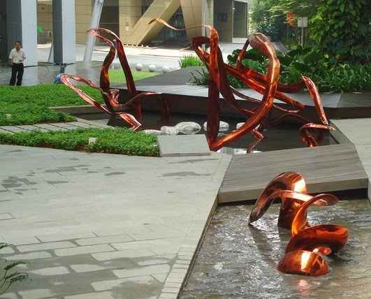
Basically it's a three-piece installation, made of twisted bronze, set in an existing water feature and complemented by special lighting underneath. At night it has a beautiful shimmering quality, but in the day without mood lighting it looks rather basic.
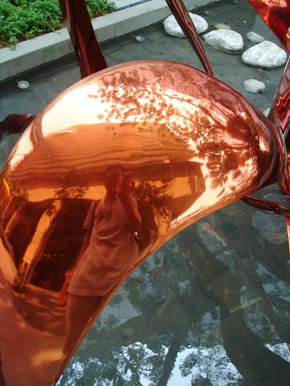
I think that its smooth texture and graceful curves demonstrates the excellent worksmanship of the sculptor. Whoa, I can see my own reflection!
Having said that, I do have some thoughts.
Just one tinsy issue.
During the unveiling ceremony, Mara was interviewed by the local papers and she said that:
I'm obsessed with natural beauty and how it's created. So Sars was very difficult for me because I found it hideously ugly and twisted.
I won't (and can't) argue aesthetics with an artist. But when an artist talks about science, I have things to say.
This is what the SARS virus looks like.
 Personally, I don't think it's ugly in appearance, in fact it reminds me of one of those Koosh balls that were so insanely popular in the '80s.
But ugly or not, there is nothing twisted about it. It just looks like a spikey ball.
Of course, Mara may be referring to the SARS main protease alone, instead of the whole virus. Proteases are enzymes that act on other proteins. After the SARS virus invades a host cell, it uses its main protease in the process of making new viruses, so inhibiting its function can stop the viruses from multiplying.
In fact Mara's sculpture is supposed to depict part of the protease that an inhibitor molecule, designed by scientists, can bind to and disrupt its activity. Here is a picture of the whole protease.
 You can see that it does have a twisted appearance, but that's simply because the protease is displayed using the "backbone" (or ribbon) representation to help researchers clearly see its three-dimensional features, such as alpha helices and beta sheets.
Using this display format, all proteins appear twisted.
Even haemoglobin, the protein that carries life-giving oxygen in our red blood cells.
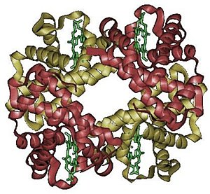
SUPER twisted.
However, there is another commonly used display format called the "space-filling" representation. This is actually a closer representation of the actual shape of the protein. If you use the space-filling representation, the SARS main protease starts to look like a delicate coral.

Not in any way twisted.
I think this picture is especially nice because on the right side of the protease you can see how the backbone representation sits inside the space-filling representation.
So to sum up - saying that SARS is ugly because it looks twisted in a backbone representation, is like saying that Antarctica is ugly because it looks "long" in a Mercator projection map.

OK, this discussion may sound really picky and irrelevant to artists. But I realize that feelings are important when they create their works of art, so it's helpful to have a fair understanding of their object of interest in order to generate the "right" kind of feelings.
To me, the SARS protease is not inherently uglier or prettier than any other protease.
It is more chilling to consider how something so tiny and so boring-looking can be an integral part of a deadly killing machine.
And uplifting to realize how an even tinier and more boring-looking inhibitor molecule can stop it in its tracks.


2 Comments:
Personally I find this scupture to be really exciting! How often does an artist even tackle something as complex as depicting a scientific discouvery....
It looks great! All proteins are twisted but the ribbion diagram version you showed did seem extremly convoluted.
Anyway i think Bioplis is lucky to have the work!
I agree that the sculpture is well-made, but I don't think luck has anything to do with it, since this sculpture was specially commissioned at a substantial cost.
Post a Comment